We carried out an audience viewing session for several members of our target audience to view our final piece and fill out a feedback form. From compiling the results it’s clear that some questions presented a mixture in answers, which could be put down to individual taste, yet some were consistent throughout. I think that audience feedback is crucial for a product to be successful because fundamentally it will be our target audience that we would want to purchase the Track and Digipack.
http://www.slideshare.net/Fudman
Friday 8 March 2013
Thursday 7 March 2013
Q4 Evaluation How did you use media technologies in the construction and research, planning and evaluation stages?
Research and Planning.
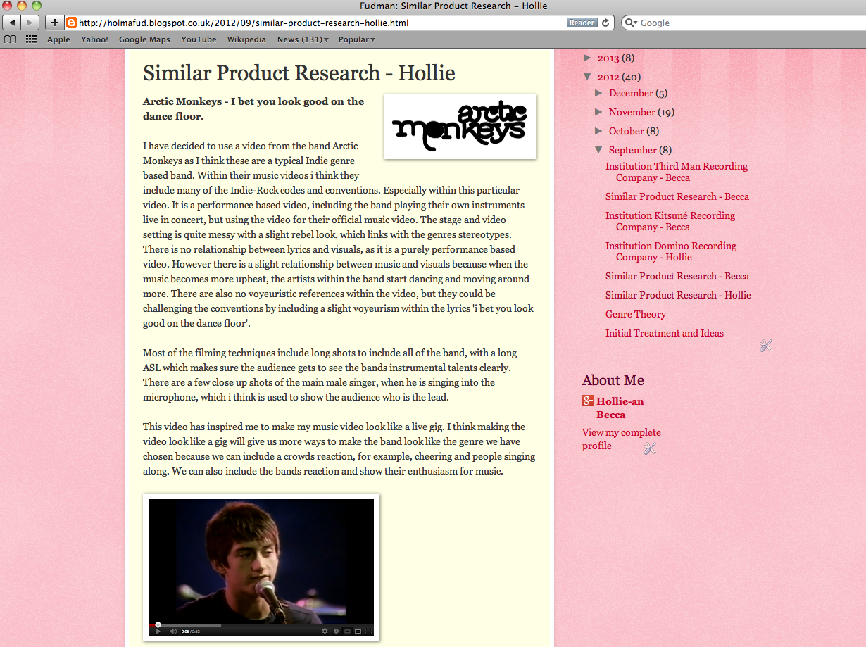
To begin with, my partner and I had to brainstorm about what genre music video we would like to direct, and also whether it would be a narrative, performance or concept based and also who would sing for our video. So we constructed our initial ideas and then conducted some similar product research for all the different types of music videos based around our chosen genre of indie rock. By researching different music videos, it widened our knowledge of what we would later want to include in ours. We constantly considered similarities and differences throughout all of the styles of music video and listed the positives and negatives of including them in our video.

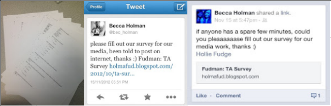
 For our target audience research we created two different types of surveys, one online and one handout. We collected results from male and females, ranged from varying ages.
Our online survey was constructed through poll daddy and posted it online on social networking sites such as Twitter and Facebook.
 After gathering lots of information we started storyboarding our ideas. We drew them out then photographed them to put on the blog. This helped us show our overall video, and helped show if we had a good narrative story and always helped us when filming to get the correct shots and help bring to life the visions that we had in our head. After finalising our storyboard we went on to create our filming schedule which helped us plan where we would go on what days, and which scenes we would shoot. It also helped us to finalise our actors, and give us time to gather the props and equipment we would need for that day of filming. We also uploaded this to our blog so we could have a permanent online reference as well as a hard copy. The film schedule and storyboard were also very useful during the editing of our music video and helped us with placing of our shots, so we could get the story in the correct order and related to the lyrics.
 For our ancillary tasks we captured the still photographs on the day of filming. The reason for this is so that all of the outfits were the same, and even the tiny details such as hair placement and accessories. We did not want any noticeable differences between our still shots and shots within the video. We took the images with a Fujifilm digital camera, this gave us very clear, good quality images which we could use for our digipak. After our music video was completed, we went through all of our pictures and picked out the ones with the best composition and lighting and then continued on to edit them, linking to our house style.
Construction.
Throughout our media production, we had to use a range of media technologies. Our experience and knowledge of the equipment varied. We were used to using the cameras, but had to learn how to correctly use the video cameras. It was good to experience a new technology and widen our knowledge of media equipment.
Cameras - We used digital cameras and video recorders to film and capture our media production. One the days of filming we had with us, our camera, video camera and a tripod. We used the tripod to film steady shots, pans of the setting, and slow paced zooms to show peoples emotions. In our opinion, use of the cameras was quite simple and so was uploading the footage and pictures onto the computers.
Adobe Photoshop.
 For the digipak and magazine advert we used Adobe Photoshop. Photoshop is an software we are very familiar with and found it very easy to use. For the ancillary task we used the photos which were taken on the day to keep continuity with costume, setting, weather and time of day. Our best images were uploaded to Photoshop where we proceeded to edit them. At first we played around with some effects to make our images more interesting as we knew they were going to be black and white. We settled with a cartoon effect which we were very happy with as it brought out more tones within the black and grey image. We cropped them to size and slightly changed the levels of the images to make sure the lighting was perfect and the images were sharp. We then converted the images to black and white to fit the house style and then we chose which pictures would go with which part of the digipak. We then added the relevant text and information to each picture and linked the theme throughout them all, and also ensuring that we kept the same font, colours and sizes.
 Final Cut Express.
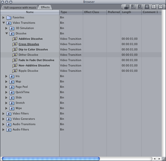
 For editing our video we used Final Cut Express. This was an unfamiliar software for us, so at first we had to learn quite a lot about it as it a difficult program to use. We uploaded our footage from the cameras and onto Final Cut. We had to capture the better shots from the longer sections of footage that we had filmed and upload them to the timeline. We then had to render our video and finally we could start adding stereotypical music video elements such as the title slide. We could also start playing around with and adding transitions e.g. a fade/dissolve, within our clips to create a smooth continuous video. We also made some of shots slow motion to really show the audience how our character was feeling and to emphasise the important scenes of the video. We changed the whole video to black and white and also added a few still shots into the video. Adding the song was quite difficult as we had to find out how to remove the sound from the video clips so only the sound of the song could be heard. We finally did this by selecting the video clips and lowering the noise levels on them and then selecting the sound clips and increasing the volume.
 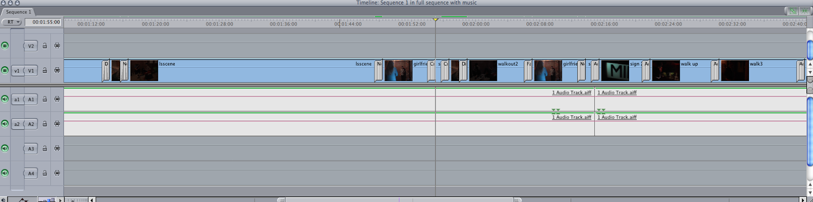 Throughout the editing of our video, we regularly posted our most recent videos onto the blog to show our progress each time we went on Final Cut to edit it. We did this by exporting the video and then converting it to a reasonable size to put on the blog.
Tuesday 26 February 2013
Q2 Evaluation - How effective is the combination of your main product and ancillary texts?
Throughout
the production of our music video we worked hard to make sure that
everything we created linked together and portrayed the right genre.
We wanted our work to have a clear noticeable style which is why we
chose the black and grey theme.
Our
black and grey theme throughout are work was quite significant but
the mise-en-scene had to precisely match otherwise the black and grey
colours would not be relevant. This is why our theme is quite dark
and emotional and it is why we carefully chose our model and made
sure he had tattoos and an indie rock style. As there is no colour
within the video it can be hard to visually see what we want to stand
out in the video. If our video was colour then for example we could
have had a red rose which could be symbolic to the slight love theme
within the video. But as we have no colour I think we had to work a
little bit harder and add in more still images to focus the audience
on what we are trying to show within the video.
We
also made our still shots black and white. We set up a dark, almost
derelict setting, to portray how sad and lost the male actor was. We
took all our shots on the same day to keep consistency throughout
lighting, outfits, and hairstyles. The weather was dull that day
which reflected the actors mood. The weather is present in both the
music video and our music video advertisement and I think this
consistency adds to effectiveness of our work.
While
planning our video we decided that the tattoos, cigarettes and grungy look would be important symbols that we would like to use because
they reflected the connotations of our indie genre but we also added
the love story as we wanted to go against the stereotypical indie
genre but keep the traditional style. These symbols contributed
greatly to the main product and ancillary texts (all the photographs)
because they add further significance to the elements in our video.
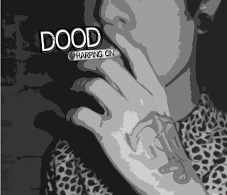
CD Front Cover.
- The cigarette which Matthew is holding is recurring object throughout the video and it holds relevance to the genre and actors style. I think it is also associated with a rebel personality which links to the genre.
- We wrote the songs name on the cigarette as we wanted to keep the cover quite simple, which is why we also added the bands name just above it instead of having a huge title.
- Also we have continued the black and white theme through to the singles cover.
- We tested a lot of effects during making this cover but settled for the slight cartoon effect as it helps show more tones within the black and grey image, and makes the tattoo more subtle instead of clearly showing it.

CD Back Cover.
- For the background image we decided to use one of our pictures of a brick wall as the brick wall is also on the front cover and also appears in the video as the walls of the male actors derelict hideout.
- We continued to add the cartoon effect for the same reasons as the front cover.
- We have also used the same font (reprise stamp) throughout all of our ancillary tasks including the title slide in the video. We felt that this font suited our genre because it is similar to other fonts used in indie rock magazines and bands, so we continued to repeat it.
- We used the polaroid image because I feel that it fits our style and fills the space nicely and adds a feeling of nostalgia. I decided to put our close up image of a guitar within it because it is a very stereotypical instrument for the indie genre and i feel that it needed to be included somehow.
- We also decided to add the conventions of a digipak such as the barcode as it is essential for selling our album, a short review so people can read other peoples opinions of the album, and the Facebook and Twitter logos to lead the audience to the band's social media.
- The title banner matches the colour scheme and has that grungy effect as the black fades out.

Lyrics Booklet.
- For the background image we used one of our main actors and applied a gaussian blur so the lyrics would be clearer to read.
- We took this image during filming so the actor is wearing the same clothes and holding the same props so that it links the ancillary to the music video well.
- We wrote the lyrics in our chosen font for the same reasons explained as above. We chose the colour white because the background is quite dark, but when it gets to the white part of the can we switch that part of the lyrics to black.

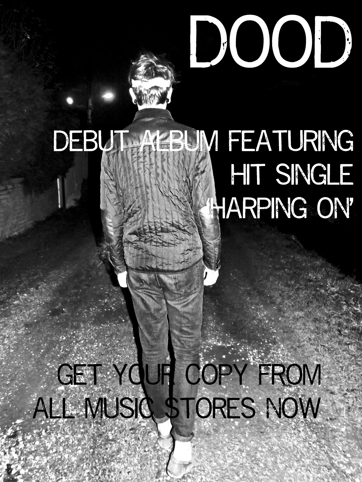
Poster.
- We left it appropriate to keep to the house style, and also have a black and grey poster. As this will be the main part that people will see, we would have to stick to the recurring theme so that people will link it to the style of the video.
- We thought this image would be most suitable for the poster. It is quite mysterious and does not really give much of the story away. It contains our main actor so people can relate and link everything when they watch the music video.
 We worked independently as a group to try our hardest at creating our own brand of music video. However, with the ancillary tasks, we felt we should look at how the professionals portray there music in their digipaks and therefore we conducted some detailed research. We were inspired by many elements, some which were very useful, and some which were less useful as they were different genre.
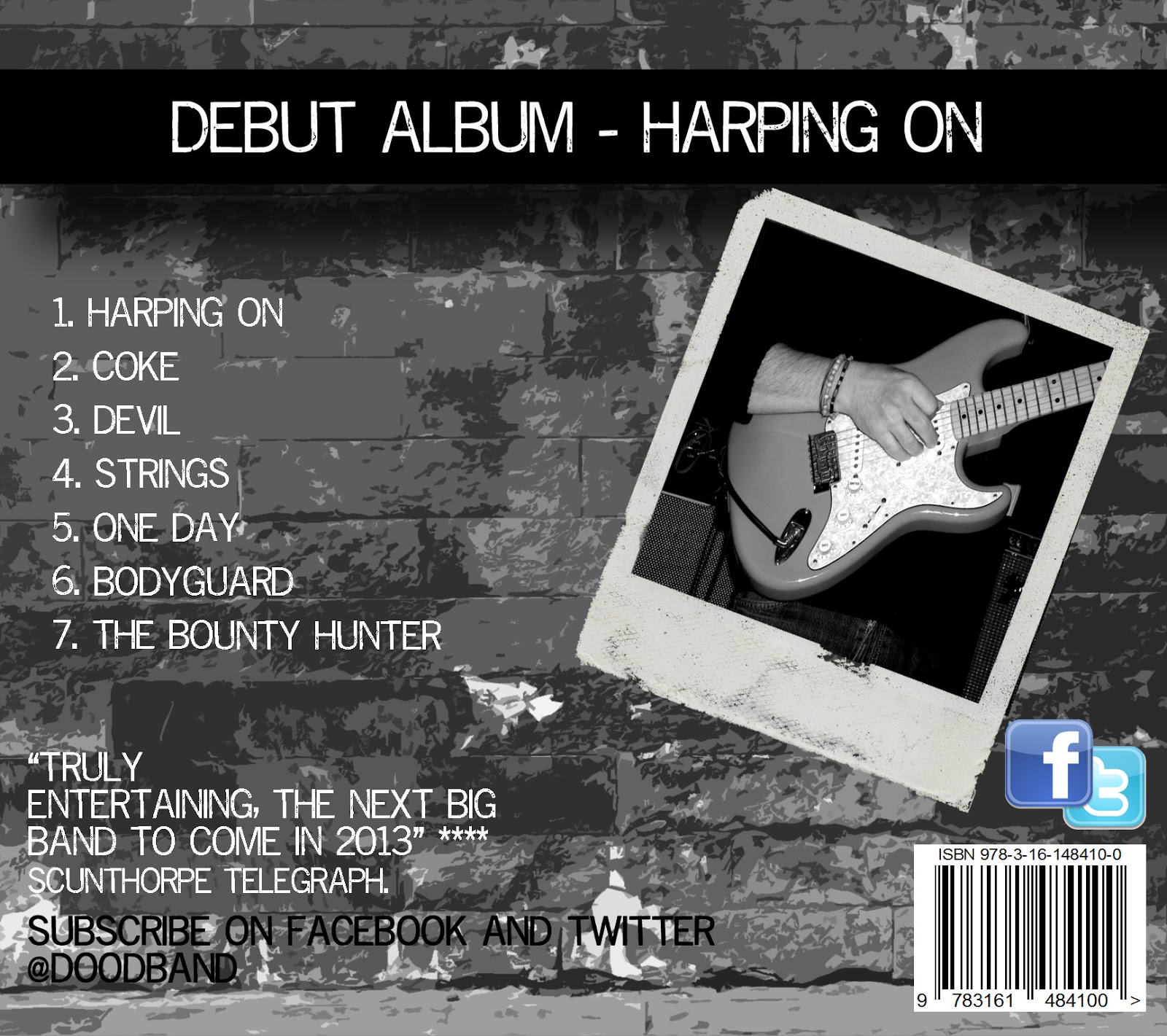

Subscribe to:
Posts (Atom)